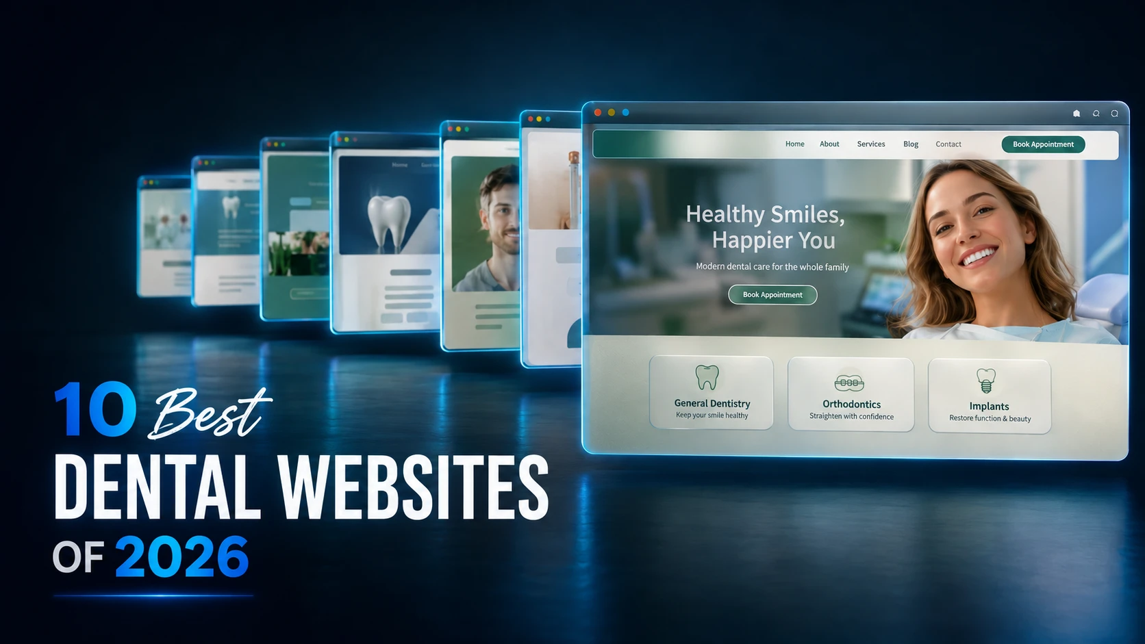
Most dental websites are the same website: a stock smile, three service cards, a blue button. The ten below are not. They commit to a typeface, a palette and a point of view – and they are built to turn an anxious first-time visitor into a booked appointment.
This is our working list of the best dental websites of 2026: real, live dental website examples, ranked, with screenshots and the specific design moves worth copying. No theory – just what the strongest practice sites are actually doing right now, and how to apply it to yours.
Quick answer – the 10 best dental websites of 2026:
- Clarkson Village Dental – Mississauga, ON
- Ajooni Smiles – Edmonton, AB
- Apollonia Dental Arts – West Milford and Cedar Grove, NJ
- Serenity Dental – Winnipeg, MB
- Integrative Dentistry NJ – West Orange, NJ
- Pacific Signature Dental – Vancouver, BC
- Ridge Road Family Dentistry – Parma, OH
- Caledon Dental Care – Caledon, ON
- Meadowvale Smiles – Mississauga, ON
- East Credit Dental – Mississauga, ON
What the winners share: an editorial typeface pairing, a calm palette with one working accent, real photography instead of drills-in-mouths stock, and a booking path that is never more than one glance away.
How we ranked these dental websites
Every site on this list was reviewed end to end in a desktop browser and scored against the same five-part rubric we use in client audits: identity and typography, layout and hierarchy, art direction, craft and finish, and patient UX. Each part is worth 20 points, and the order below follows the scores.
Full transparency: several of the sites here were designed or are managed by our team at Aspire. They were scored with the same rubric as everything else – if anything, we are harder on our own work, because this list doubles as our internal notebook of what to steal and what to fix.
| # | Practice | Location | Signature move |
|---|---|---|---|
| 1 | Clarkson Village Dental | Mississauga, ON | Editorial serif + numbered service lists |
| 2 | Ajooni Smiles | Edmonton, AB | Forest-green and gold identity system |
| 3 | Apollonia Dental Arts | West Milford and Cedar Grove, NJ | Conversion-first utility bar and proof badges |
| 4 | Serenity Dental | Winnipeg, MB | Spa-grade whitespace and a serif wordmark |
| 5 | Integrative Dentistry NJ | West Orange, NJ | One indigo accent doing every job |
| 6 | Pacific Signature Dental | Vancouver, BC | Real photography of the actual office |
| 7 | Ridge Road Family Dentistry | Parma, OH | High-contrast serif with an italic accent word |
| 8 | Caledon Dental Care | Caledon, ON | Offers designed as visual objects |
| 9 | Meadowvale Smiles | Mississauga, ON | Benefit-led comfort cards |
| 10 | East Credit Dental | Mississauga, ON | Black-and-gold premium positioning |
1. Clarkson Village Dental - Mississauga, ON

Website: clarksondentist.com
The only site on this list that reads like it was art-directed rather than assembled. A transitional serif carries the headlines over a warm off-white ground, the accent is a restrained sage-teal, and – the signature move – services are set as numbered editorial lists separated by hairline rules instead of the usual three-card grid. Even the implant photography is styled like a magazine still life, and the navigation absorbs a whole sub-brand (Clarkson Smiles Orthodontics) without breaking rhythm. The “est. 2002” line is worked into the header and hero, so two decades of history does quiet trust-building on every page.
Steal this: replace one card grid with a numbered list and hairline rules. It instantly reads as considered design rather than a template block.
2. Ajooni Smiles - Edmonton, AB

Website: ajooni.teethcare.ca
The strongest pure identity in the set. Deep forest green, warm cream and a disciplined gold accent, with a small-caps serif that gives every heading a bit of ceremony – it feels closer to a boutique hotel than a clinic, which is exactly the point. The dark stat band (rating, seven-day availability, years of experience) turns plain numbers into a design moment, and every component down to the icon chips belongs to the same family. Nothing on this site looks borrowed.
Steal this: commit to one palette and one type pairing, then let every section inherit them. Consistency is what makes a site feel expensive.
3. Apollonia Dental Arts - West Milford and Cedar Grove, NJ
Website: aspire.teethcare.ca
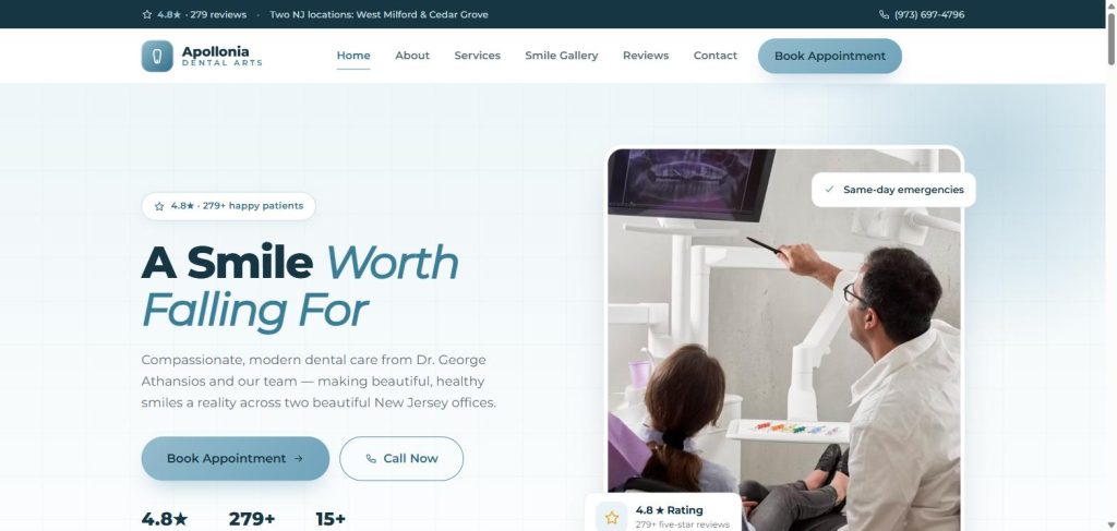
The most conversion-minded build here. A slim utility bar pins the review score, both New Jersey locations and the phone number above the navigation, so proof and contact ride along on every page. The hero pairs a friendly italic serif accent with a floating rating badge, a working before-and-after slider shows results instead of describing them, and a “serving NJ since 2009” plate overlaps the doctor photo like a wax seal. Under the styling sits a clean teal token system applied with real discipline.
Steal this: the utility bar. Rating + locations + click-to-call in one quiet strip beats three separate widgets fighting for attention.
4. Serenity Dental - Winnipeg, MB
Website: serenity.teethcare.ca
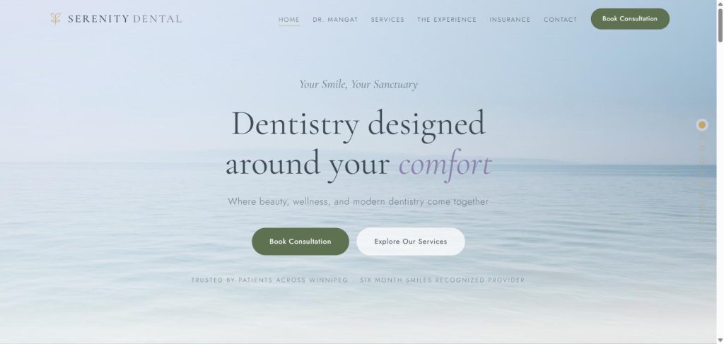
Most “spa dentistry” sites claim the mood; this one builds it. A wide-tracked serif wordmark, sage and soft gold, oceans of whitespace and a scroll-dot rail down the right edge give the whole page a slow, deliberate pace. The welcome section – editorial headline, italic accent word, office photography – sells comfort-first dentistry without a single exclamation mark. It is a masterclass in letting negative space do the persuading for a premium, anxiety-aware positioning.
Steal this: if your positioning is calm and premium, double your section padding and halve your word count. Whitespace is the cheapest luxury signal there is.
5. Integrative Dentistry NJ - West Orange, NJ
Website: integrativedentistrynj.com
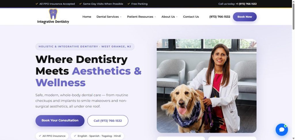
The cleanest color system on the list. One confident indigo-violet does every job – pill badges, icon chips, buttons, links – over white and a pale lilac tint, so the page always knows where your eye should go. The “whole-body dentistry” positioning is matched by calm, benefit-first copy, and the hero leads with practical trust chips (all-PPO insurance, four languages) instead of adjectives. A tight component system like this is what makes a site easy to extend without it drifting off-brand.
Steal this: pick exactly one accent color and give it every interactive job. When everything important shares a hue, patients stop hunting for the button.
6. Pacific Signature Dental - Vancouver, BC
Website: pacificsignaturedental.ca
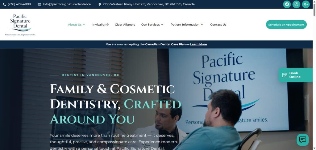
The rare dental homepage shot inside the actual practice – the hero shows the team at work with the clinic’s own signage on the wall, under a deep navy overlay that keeps the small-caps serif headline legible. That one choice does more trust-building than any stock model could: patients see the room they will actually sit in. A persistent Book Online tab rides the right edge, and the stat row (10+ years, multilingual team, digital dentistry) is set in the same quiet serif system rather than shouting.
Steal this: book a half-day photo shoot in your own operatory. Real rooms and real people convert anxious searchers better than any stock library.
7. Ridge Road Family Dentistry - Parma, OH
Website: ridgeroadfamilydentistry.com
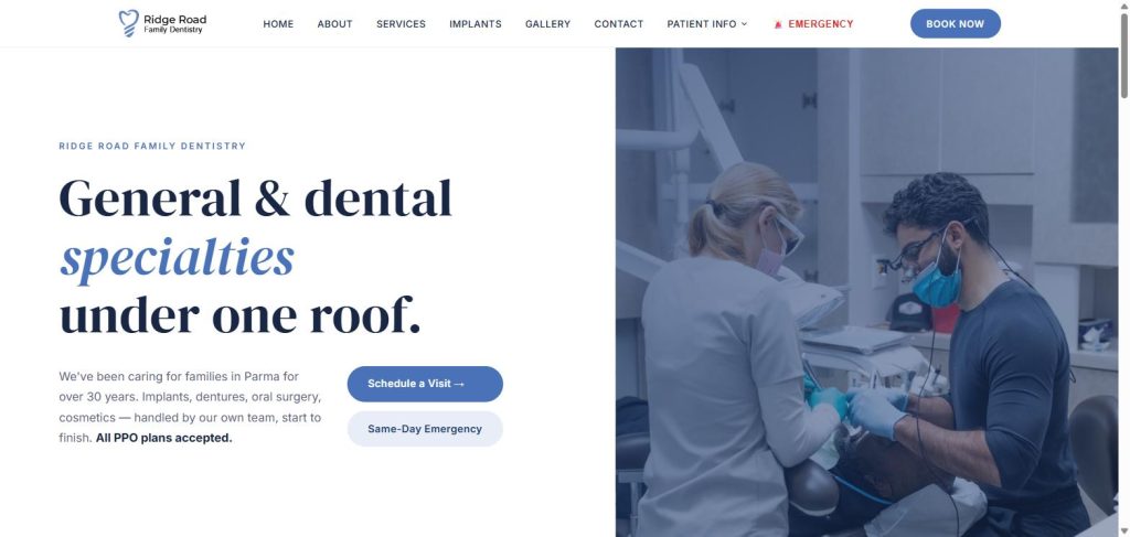
The best single headline in this ranking. A high-contrast editorial serif sets “General and dental specialties under one roof” – with the one differentiating word pulled out in periwinkle italic. That tiny typographic decision communicates the practice’s entire value proposition (specialty work handled in-house, per the site, for over 30 years) before a visitor reads a single paragraph. The split hero, quiet blue-tinted photography and dark footer keep the rest of the page out of the headline’s way.
Steal this: find the one word that separates you from the practice down the road and give it its own typeface treatment. One italic word can do the work of a paragraph.
8. Caledon Dental Care - Caledon, ON
Website: caledondentalcare.ca
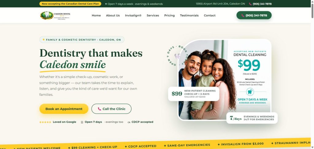
The best above-the-fold composition in the set. An eyebrow pill sets the context, the serif headline gets a hand-drawn yellow underline on “Caledon smile,” a warm family photo carries a rotating “open 7 days” badge – and the new-patient offer is designed as an actual object: a $99 cleaning card with its own typography, icon and shadow, sitting on the photo like a coupon you could pick up. Proof chips (Google rating, seven-day hours, CDCP accepted) line up neatly under the calls to action instead of cluttering the headline.
Steal this: stop writing offers as sentences. Design your new-patient offer as a card with a price, a value anchor and a border – objects get noticed, lines of text get skimmed.
9. Meadowvale Smiles - Mississauga, ON
Website: meadowvalesmiles.com
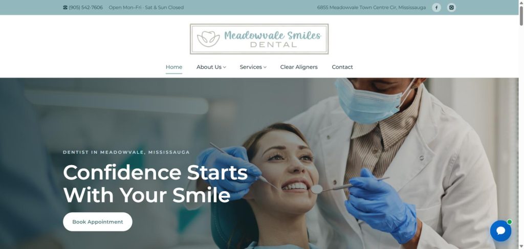
A study in tidy restraint. The dusty-teal and navy palette stays calm, the layout never crowds, and the three lead cards are written as patient benefits – “Comfort-First Experience,” “Complete Family Care,” “Flexible and Affordable” – rather than as a list of procedures. Insurance reality (CDCP, direct billing, payment plans) is addressed in the first screen instead of being buried on a policies page, which is exactly what price-anxious families are scanning for.
Steal this: rewrite your top three cards as benefits a patient would say out loud. “Sedation options” is a feature; “stress-free visits for nervous patients” is a reason to book.
10. East Credit Dental - Mississauga, ON
Website: eastcreditdental.ca
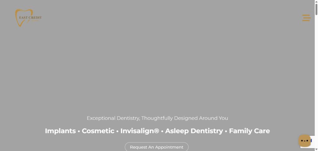
The boldest palette gamble on the list: near-black grounds, a gold-line tooth mark and serif headings that position the practice firmly at the premium end – a fit for a clinic whose homepage leads with implants, cosmetic work and asleep dentistry. Gold-outline buttons and generous dark space give the service sections a gallery feel, and the effect is unmistakably different from every white-and-blue competitor in Mississauga.
Steal this: match your palette to your flagship procedure’s price point. If you want implant and full-arch cases, a dark, gallery-style treatment signals it long before the copy does.
What the best dental websites have in common
Rank the strongest dental website designs side by side and the same seven decisions keep showing up:
1. Real faces and real rooms above the fold
The top sites lead with people smiling or the practice itself – never a gloved hand holding a drill. Fear imagery is the fastest way to lose the exact patient who is already nervous about booking.
2. One committed typeface pairing
Every site in the top half pairs a characterful display face (usually a serif) with a quiet workhorse for body text – and then never deviates. The bottom of our scoring table was full of sites using one generic sans at six sizes.
3. A calm palette with one working accent
Forest green and gold, indigo on lilac, navy and teal: in each case a single accent color owns every button and link, so the eye always knows what is clickable.
4. Booking is never more than a glance away
Above-the-fold booking plus a persistent element – a sticky header button, a floating Book Online tab, click-to-call in a utility bar. If you spend money on Invisalign marketing or any paid campaign, this is the click that decides whether the spend converts.
5. Proof sits next to the promise
Ratings badges, review counts, “established” dates and provider credentials appear beside headlines and calls to action – not on a separate awards page. Trust works hardest at the moment of decision.
6. Offers are designed as objects
The strongest conversion sections treat the new-patient offer as a designed card with a price and a value anchor. The same logic powers effective dental implant marketing: a concrete, visual offer beats an abstract promise.
7. Structured for search – and for AI answers
Clean heading hierarchies, question-led FAQ sections and schema markup are what let a practice site get cited when patients ask Google – or ChatGPT – who to see. Design and SEO stopped being separate jobs a while ago.
How to apply this to your own practice
You do not need all ten moves at once. Pick the one that matches your practice’s positioning – a benefit-led card row, a designed offer, a real photo shoot – and ship it this quarter. Design changes on this scale are measurable: watch booking clicks and calls, not compliments.
If you would rather hand it off, this is literally our day job. Our dental website design and development team builds sites like the ones above, our SEO for dentists service makes sure patients actually find them, and our guide to digital marketing for dentists shows how the whole system fits together – including the social content that keeps the brand alive between visits.
Frequently asked questions
What makes a great dental website?
A committed visual identity (one typeface pairing, one palette), real photography of the team and office, a clear content hierarchy, proof beside every promise, and a booking action that is always one glance away. Under the surface it needs fast load times and structured content so search engines and AI assistants can read it.
How much does a dental website design cost?
It varies widely. Template-based builds typically start around a few thousand dollars, while fully custom design and development commonly runs $5,000 to $15,000 or more. Many dental marketing agencies also bundle design into monthly plans alongside hosting and SEO. The most expensive option is usually the cheap site that never converts a visitor.
What pages should a dental website include?
At minimum: a homepage built to convert, one page per core service (implants, Invisalign or clear aligners, emergency care), an about or team page with real photos, a new-patient page covering insurance and financing (including CDCP in Canada), a contact page per location, and an FAQ or blog that answers the questions patients actually search.
Should dentists use stock photography?
Sparingly, and never for the hero. Real team and office photography outperforms stock because patients are deciding whether they trust a specific room and specific people. If you must use stock, avoid clinical close-ups – drills, retractors and gloved hands in mouths push anxious patients away.
How often should a dental practice redesign its website?
Most practices get 3 to 5 years from a strong design, refreshed sooner after a rebrand, a move or a major shift in services. Continuous small improvements – better photos, tighter offers, faster pages – usually beat a big-bang rebuild.
Who designs the best dental websites?
Teams that live in dentistry every day – they already know the compliance rules, the patient psychology and the local SEO game. We keep a separate ranking of the top dental marketing agencies if you are comparing partners for a project like this.
Ready to grow your dental practice?
Get a free, no-obligation strategy session and a custom growth plan for your practice.
Book Your Free Call →Keep Reading